Fight San Francisco Crime with fast.ai and Deepnote
- #machine-learning
- ·#data-science
 Photo by ev on Unsplash
Introduction
When most people picture San Francisco and the Bay Area, various positive connotations such as the Golden Gate Bridge, Chinatown, and software companies come to mind. However, like any metropolitan area, its dense population and wealth gap leads to an environment of lots of crime. Thanks to initiatives such as SF OpenData and Kaggle's San Francisco Crime Classification competition, data compiled from all of this crime can be leveraged to better handle and respond to it.
In particular, this article will focus on how Deepnote's Jupyter-backed notebook environment and fast.ai's effective encapsulation of machine learning data preparation greatly improve data scientist efficiency.
Deepnote Setup & Integrations
Providing full control of my compute environment gives Deepnote a big leg up when deciding between notebook tools for a project. By full, I mean having access to define the Dockerfile exactly how I'd like. This allows me many options, such as installing C/C++ dependencies of python wrapper libraries that don't handle installation automatically in their setuptools process. Sure, there are other ways around this particular issue. However, having access to their environment's container definition allows you to solve most issues that come your way.
You may have noticed an additional init.ipynb notebook in the project initialization section of the screenshot. This notebook gets invoked every time the underlying machine is brought up. In this notebook, you can put any cumbersome or otherwise tedious logic that you would like to be "just done" when the main notebook starts.
![A screenshot of the direct configuration of a Dockerfile in Deepnote [Image by Author]](/_next/image?url=%2Fimages%2Fblog%2F9bafeabaf61b.png&w=3840&q=75&dpl=dpl_6u4nkXftLD4jBegk6v4af3gcFsuv) A screenshot of the direct configuration of a Dockerfile in Deepnote [Image by Author]
A screenshot of the direct configuration of a Dockerfile in Deepnote [Image by Author]
I've also set up two integrations that have pre-loaded use for the main notebook: an S3 bucket and an environment variable. While the data for the challenge is freely available here on Kaggle, I copied the data into an S3 bucket and created an IAM role that has read-only access to it. This way, the data is available to the notebook on startup and the read-only credentials do not create any security issues.
![A screenshot of the active integrations in the Deepnote notebook [Image by Author]](/_next/image?url=%2Fimages%2Fblog%2F346617245dc7.png&w=3840&q=75&dpl=dpl_6u4nkXftLD4jBegk6v4af3gcFsuv) A screenshot of the active integrations in the Deepnote notebook [Image by Author]
A screenshot of the active integrations in the Deepnote notebook [Image by Author]
By connecting the S3 bucket as an integration, the notebook makes the data available to the environment at /datasets/s3-data-bucket! No boto3 or file syncing is needed.
Additionally, I created an environment variable that holds the S3 bucket name for reference. The main thing I enjoy here about environment variables as an "integration" is the cleanliness of having your variables set and ready for use without any eye-sore notebook cells that make several assignments to os.environ. Remember: with notebooks that are meant to be consumed by readers that may not care about every last command executed, less code is better.
import os
print(f"The contents of the S3 bucket connected to this notebook have been automatically transferred locally.\n"
      f"S3 Bucket: s3://{os.environ['S3_BUCKET']}\n"
      f"Local directory: /datasets/s3-data-bucket\n"
      f"\nContents:")
!ls /datasets/s3-data-bucket
random_state = 42
train = pd.read_csv("/datasets/s3-data-bucket/train.csv")
train.drop_duplicates(inplace=True)
train.reset_index(inplace=True, drop=True)
print(f"Loaded the dataset of {train.shape[1]}-D features")
test = pd.read_csv("/datasets/s3-data-bucket/test.csv", index_col='Id')
print(f"# train examples: {len(train)}\n# test examples: {len(test)}")
del test
# remove from clear outliers from the data set, allowing fast.ai to impute the values via `FillMissing` later on
train.replace({'X': -120.5, 'Y': 90.0}, np.NaN, inplace=True)
Data Schema
Ok, let's have a proper look at the tools we have for classifying this crime.
- Dates --- timestamp of the crime incident
- Category --- a category of the crime incident (only in train.csv). This is the target variable you are going to predict.
- Descript --- detailed description of the crime incident (only in train.csv)
- DayOfWeek --- the day of the week
- PdDistrict --- the name of the Police Department District
- Resolution --- how the crime incident was resolved (only in train.csv)
- Address --- the approximate street address of the crime incident
- X --- Longitude
- Y --- Latitude Not bad! Timestamps and location usually go a long way towards predictive performance.
![A quick sample of the data set, prior to feature engineering [Image by author]](/_next/image?url=%2Fimages%2Fblog%2F98054dfc487c.png&w=3840&q=75&dpl=dpl_6u4nkXftLD4jBegk6v4af3gcFsuv) A quick sample of the data set, prior to feature engineering [Image by author]
A quick sample of the data set, prior to feature engineering [Image by author]
Biases and Simplifications
To keep the first iteration of model training brief, let's apply the following simplifications to the task:
-
Remove the
DayOfWeekcolumn. This change is not for any reason other than thatfast.aiprovides a thorough functionality to convert a date-time feature to several such features. One of these features is indeed the day of the week. We'll see more on this later in the article. -
Remove the
Resolutioncolumn, a feature that is available only during training. There are many ways we can use such a feature, but let's forego them for this modeling iteration. -
Remove the
Descriptcolumn. This is another feature that is available only during training and specifies the category of the crime on a more granular level. We will refrain from using this, as in (2). -
Target binary classification of the "Larceny/Theft" category. We will do this mainly for the convenience of model performance analysis in this notebook. Many more visual techniques can be trivially applied to binary classification techniques than their multi-class counterparts. I encourage everyone to build a multi-class classifier from this notebook.
At the end of the article, I will provide suggestions for the use of the omitted features.
# drop unused columns
train.drop(["DayOfWeek", "Resolution", "Descript"], axis=1, inplace=True)
# target certain crime event categories
targeted_cats = [
'LARCENY/THEFT'
]
train["TargetedCategory"] = train.Category.isin(targeted_cats)
train.drop("Category", axis=1, inplace=True)
print(f"The {len(targeted_cats)} targeted categories occur in {100. * train.TargetedCategory.mean():.2f}% of the samples.")
Feature Additions
Address on a Block
Many of the roads in the data have several blocks that are explicitly indicated in the Address feature. Therefore, beneficial information should exist to aid in classifying the crime categories based on this.
Address at Road Intersection
Similarly to block indications, the Address feature specifies when the crime occurred at the intersection of two roads. Naturally, intersections bring together different flows of human and vehicular traffic. It stands to reason that this flow conflict leads to certain types of crime more than others.
Road Occurrence Frequency
In addition to knowing which road(s) a crime has occurred on, knowledge of how frequent those roads appear in the dataset can help insight into the crime categories. To reconcile road frequency at road intersections, we take the mean of the individual road probabilities. Additionally, for increased numerical stability, we'll use logarithmic probability as the final feature.
train['IsOnBlock'] = train['Address'].str.contains('block', case=False)
train['IsAtIntersection'] = train['Address'].str.contains('/', case=False)

def clean_road(text):
    return re.sub(r"[0-9]+ [bB]lock of ", "", text)

def make_counts(values):
    counts = Counter()
    for value in values:
        cur_counts = list(map(clean_road, value.split(" / ")))
        counts.update(cur_counts)
    return counts

# compute road counts, in preparation of the log road probability feature
counts = make_counts(train["Address"])
common_roads = pd.Series(dict(counts.most_common(20)))

# have a look at the most common roads in the data
plt.figure(figsize=(10, 10))
with sns.axes_style("whitegrid"):
    ax = sns.barplot(
        (common_roads / common_roads.sum()) * 100,
        common_roads.index,
        orient='h',
        palette="Blues_r")

plt.title('Most Common Roads', fontdict={'fontsize': 16})
plt.xlabel('P(x)')

plt.show()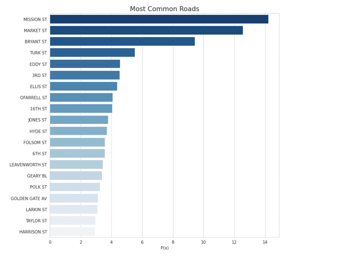
# finalize the log road probability feature
pd_counts = pd.Series(counts)
log_probas = np.log(pd_counts / pd_counts.sum())
# have a look at the distribution of log road probabilities in the data
plt.figure(figsize=(10, 10))
sns.displot(log_probas.values)
plt.xlabel('ln(P(road))')
plt.ylabel('P(x)')
_ = plt.title("Distribution of Log Probas for Street Occurrence", fontdict={'fontsize': 16})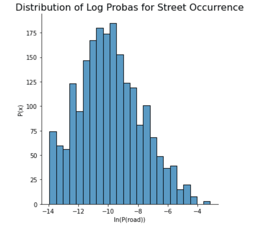
# with the street probabilities, we can now assign them to each sample.
# as mentioned before, samples on street corners receive the mean of each street probability.
def assign_street_probabilities(address, probabilities):
return np.mean([
probabilities[clean_road(road)]
for road in address.split(" / ")
])
train["RoadProba"] = train["Address"].map(partial(assign_street_probabilities, probabilities=log_probas))
train.drop("Address", axis=1, inplace=True)
As a final analysis of the log road probability feature, let's take a look at the distribution separation this feature provides. Although our final model will incorporate much more than just this individual feature for decision-making, it is still a good signal if we see some differences in the feature distributions by class. Indeed, we do see some differences in the magnitude of the distribution modes and some additional differences in probability mass outside the neighborhood of the most significant modes. This feature should work quite well for our use case!
plt.figure(figsize=(12, 8))
sns.distplot(train.loc[~train["TargetedCategory"], "RoadProba"], hist=False, label="Not Targeted")
sns.distplot(train.loc[train["TargetedCategory"], "RoadProba"], hist=False, label="Targeted")
plt.legend()
_ = plt.title("Label Separation for Log Road Probabilities")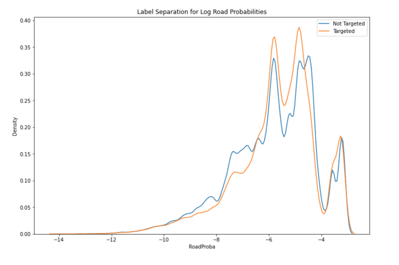
Data Set Profiling, Thanks to pandas-profiling
Amidst all of this manual feature design and code, I would be remiss to not mention the fantastic reports from the pandas-profiling package. Many of the insights and issues that you may come across through manual grunt work you can instead extract immediately from these reports. For all future projects, I highly recommend you have a look through a similar such report on your data before you start coding away cell after cell. You will likely save a lot of time doing this.
profile = ProfileReport(train, minimal=True, title="SF Crime Data Set Profile")
profile.to_notebook_iframe()![Only the very beginning of a very detailed report from pandas_profiling [Image by author]](/_next/image?url=%2Fimages%2Fblog%2Fecee9dbc6daf.png&w=3840&q=75&dpl=dpl_6u4nkXftLD4jBegk6v4af3gcFsuv) Only the very beginning of a very detailed report from pandas_profiling [Image by author]
Only the very beginning of a very detailed report from pandas_profiling [Image by author]
Streamlined Data Preparation with fast.ai
Ok, now it's time to have fast.ai take the wheel and handle a lot of stuff for us. Thanks to some well-designed functions, we can clean and prepare our data set in a much more efficient manner, while remaining confident that machine learning best practices have been followed under the hood.
First up, we have some stellar datetime feature support. Note that I said feature support and not parsing support. Sure, the library does a good job at auto parsing several date data types. The real benefit, however, lies in the new features automatically created for you. Simply specify the datetime column in your pandas DataFrame and whether you want to keep that column after the transformation. Check out what you receive below:
old_columns = train.columns
train = add_datepart(train, "Dates", drop=False)
new_columns = list(set(train.columns) - set(old_columns))
print(f"add_datepart created {len(new_columns)} created new features")
for i, new_column in enumerate(new_columns):
print(f" {i + 1}. {new_column}")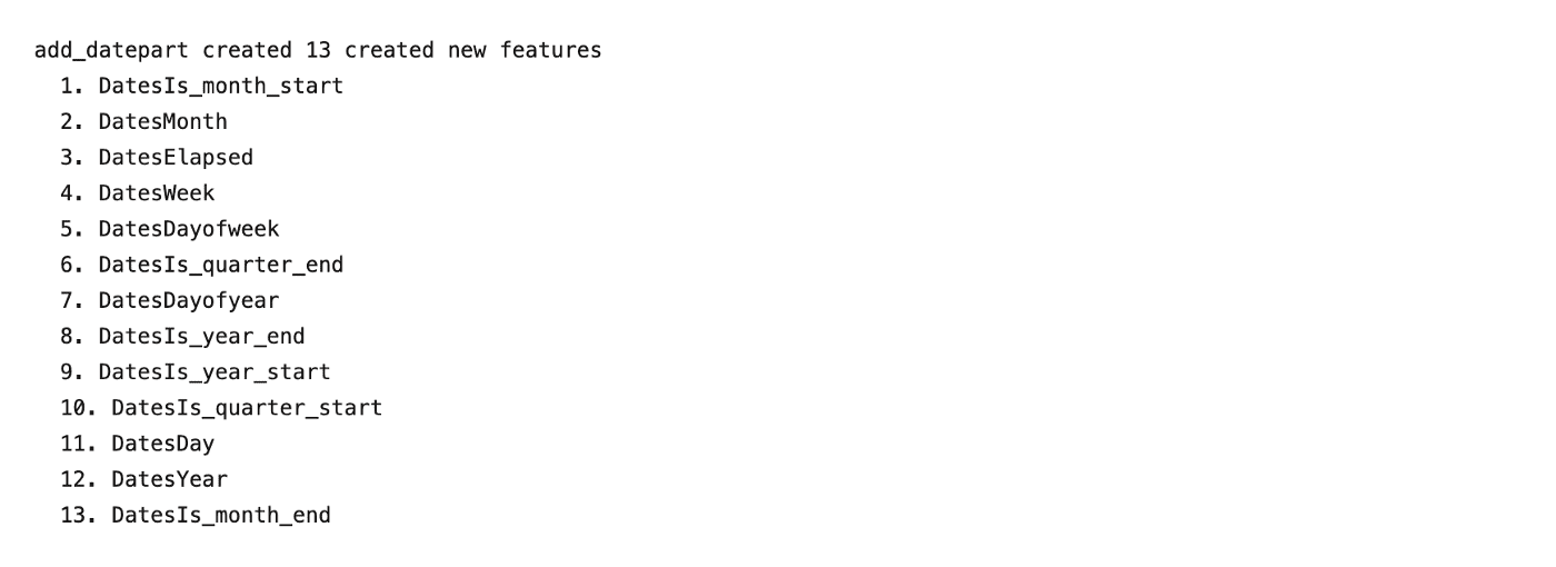
How's that for some datetime processing? Say goodbye to all of your manual grunge code for engineering timestamp features. Let's keep moving, there's even more to get excited about.
We'd also like to be able to handle strings and missing data well. A typical approach is to turn the strings into one-hot categorical features and choose from a number of data imputation methods for missing data. Instead of this more manual approach, let's use fastai's TabularPandas class, which essentially is an enhanced pandas DataFrame.
Three powerful aspects of the TabularPandas class are Normalize, Categorify, and FillMissing. All of these offerings are TabularProcs. A TabularProc is like a regular Transform in fast.ai, except for in-place functionality and eager one-time processing (instead of pandas-style lazy processing). The combination of these two features make TabularProcs very efficient for data set preparation.
Normalize is a TabularProc that performs basic mean-variance data normalization.
Categorify is a TabularProc that replaces a column with a numeric categorical column.
FillMissing is a TabularProc that replaces missing values with the median of the column and creates a new Boolean column that is set to True for any row where the value was missing. The combination of these two features is powerful, as you still inform the model of when the data was missing, while also imputing a value for unaffected numerical computations.
In a moment, we'll see the TabularPandas class, which brings all of these functionalities under one hood. However, we will need to specify to that class which of our features are continuous and categorical.
Time for a manual method to write?
No. Time for another convenience method to call in fast.ai.
We can handle that automatically using the helper function cont_cat_split, shown below. This is just another example of data set preparation logic that fast.ai seamlessly handles for you while allowing for slight customization where necessary.
cont, cat = cont_cat_split(train, max_card=5, dep_var="TargetedCategory")
cat.remove("Dates")
print(f"{len(cont)} Continuous columns: {cont}")
print(f"{len(cat)} categorical columns: {cat}")
With this knowledge in hand, we can now initialize the TabularPandas class, which uses our defined TabularProcs and feature categorizations to provide a powerful wrapper around our training DataFrame. A lot of the benefit of this class comes from the ease in which you can immediately train a deep learning model from its interface. Instead, we are focused here on the ease in which this class can be used to quickly hand data over to other popular ML libraries in their native interface.
This means seamless integration with external libraries! As you see below, obtaining the underlying numpy data of this class is achieved by simply accessing these properties (assuming obj is an instance of TabularPandas):
obj.train.xs.valuesobj.train.ys.valuesobj.validation.xs.valuesobj.validation.ys.valuesEt voilà! That's all you need. Let's train the model.
Model Training
I mentioned the availability of several different machine learning libraries to training models. Try not to spend much time poring through the details of each; there are numerous python packages that provide great support for training ML models and it is hard to be wrong. Many people getting started in machine learning focus too much on the choice of algorithm, largely due to the style in which they've learned from instructors. Focusing on algorithms is very effective for studying machine learning. When you must then apply that knowledge via software, remember to keep most of your effort on the data pipeline. Once you have the right data ready for learning, many software packages will get you similar performance.
For training tree-based models, some of the most popular packages are sklearn, xgboost, and lightgbm. Here is my opinion on each of them, from my own experience:
sklearnis best for its wide breadth of algorithms offered. If you need to potentially use many different ML algorithms in your pipeline, usesklearn.xgboostandlightgbmare better when you know you want to use gradient boosting or random forests.xgboostlong was the library of choice, but Microsoft releasedlightgbmin 2017, showing more computationally efficient modeling and better accuracy. With better performance and support from a giant company, I likelightgbmmoving forward. For a deeper look into a comparison ofxgboostandlightgbm, check out this article by @sainikhilesh on Medium.
def time_split(df, validation_pct=0.2):
  df = df.sort_values("Dates")
  split_date = df.loc[df.index[int(len(df) * (1 - validation_pct))], "Dates"]
  return df.index[df["Dates"] <= split_date], df.index[df["Dates"] > split_date]

train_idx, validation_idx = time_split(train, validation_pct=0.2)
print(f"Training data has {len(train_idx)} samples from {train.loc[train_idx, 'Dates'].min()} to {train.loc[train_idx, 'Dates'].max()}")
print(f"Validation data has {len(validation_idx)} samples from {train.loc[validation_idx, 'Dates'].min()} to {train.loc[validation_idx, 'Dates'].max()}")
train.drop("Dates", axis=1, inplace=True)
to = TabularPandas(train,
  procs=[Categorify, FillMissing, Normalize],
  cat_names=cat,
  cont_names=cont,
  y_names="TargetedCategory",
  splits=[list(train_idx), list(validation_idx)])
X_train, y_train = to.train.xs, to.train.ys.values.ravel()
X_validation, y_validation = to.valid.xs, to.valid.ys.values.ravel()
mask_positive_class = (y_validation == 1)
print(f"The train set has {np.bincount(y_train)[1]} positive labels.")
print(f"The validation set has {np.bincount(y_validation)[1]} positive labels.")
params = {
  'boosting': 'gbdt',
  'objective': 'binary',
  'is_unbalance': True,
  'num_class': 1,
  'learning_rate': 0.1,
}
train_data = lgb.Dataset(X_train, label=y_train, categorical_feature=['PdDistrict'])
model = lgb.train(params, train_data, 250)
y_train_pred = model.predict(X_train)
y_pred = model.predict(X_validation)
joblib.dump(model, "model.jbl")
print("Saved trained model")
Analysis
Alright, the model finished training. Let's pack it up and go home!
No, now it's time to look across several facets of the model's performance, to gauge whether it is sufficient or in need of improvement. For these kinds of analyses, I love plotly. I've been through several visualization libraries, from matplotlib to seaborn to yellowbrick to vega to d3.js. My general rule from all of this experience is the following:
- Use the library you have memorized the most for code that only you see
- Use the library that produces the "best" plots for code that others will see
- Use the library that produces the most interactive plots for reports that non-technical consumers will use
Of course, defining "best" is relative. However, I roughly attribute value to visualization libraries where they have a rich feature set, plenty of examples, and great documentation. For this reason,
seabornquickly beat outmatplotlibuntilplotlyeventually won out for the reasons just mentioned plus interactivity. Isplotly's code verbose. Sure, a little bit. However, it is much more important how your results are perceived by your end consumers. I would bet money on verboseplotlycreating more value for your consumers than a few lines ofmatplotlib.
You may be wondering "what about streamlit?". The streamlit library is a web server and interface, which has some level of support for all visualization libraries just mentioned. It also has a component-based design for extensions, so any visualization library can reasonably be plugged in.
Score Distributions
First up, let's compare score distributions, both across classes and data sets.
Comparing class-wise score distributions, we want to see as much separation as possible between the predictive distributions of the positive and negative class. Otherwise, our performance will surely be poor. Indeed, we do see a fair amount of separation here, but there is much room for improvement.
Next, we do not want to see much separation between the model's predictive distributions on the train vs validation sets. The reasoning for this is straightforward: for any (preferably large and) unbiased sample of data presented to the model, we expect the sample's distribution to closely resemble the true distribution of the data. Additionally, we expect the model's score on these sample sets to closely resemble each other; otherwise, the model has some bias that needs to be addressed.
By comparing the plots, we see that there is a notable positive shift in the model's scores on the validation data set. This suggests one of two things is occurring: 1. The validation set's distribution varies significantly from the train set. 2. The trained model has a learned bias, which did not generalize well to the validation set.
I suspect that (2) is occurring since the validation set was selected based on time. While it is very possible that something in the universe changed between the dates of the train and validation sets, I believe it is more likely that the model has failed to appropriately generalize.
fig = make_subplots(
    rows=1, cols=2,
    subplot_titles=(
        "Classwise Score Distributions",
        "Train vs Validation Score Distributions"
    )
)

# class-wise score distributions
fig_distplots = ff.create_distplot(
    [y_pred[~mask_positive_class], y_pred[mask_positive_class]],
    ["Negative", "Positive"],
    show_hist=False, show_rug=False,
)
for trace in fig_distplots.select_traces():
    fig.add_trace(trace, row=1, col=1)
fig.update_xaxes(range=(0, 1), row=1, col=1)
fig['layout']['xaxis2']['title'] = dict(text='Score')
fig['layout']['yaxis2']['title'] = dict(text='P(Score)')

# train vs validation score distributions
fig_distplots = ff.create_distplot(
    [y_train_pred, y_pred],
    ["Training", "Validation"],
    show_hist=False, show_rug=False
)
for trace in fig_distplots.select_traces():
    fig.add_trace(trace, row=1, col=2)
fig.update_xaxes(range=(0, 1), row=1, col=2)
fig['layout']['xaxis2']['title'] = dict(text='Score')
fig['layout']['yaxis2']['title'] = dict(text='P(Score)')
fig.update_layout(showlegend=False)

fig.show()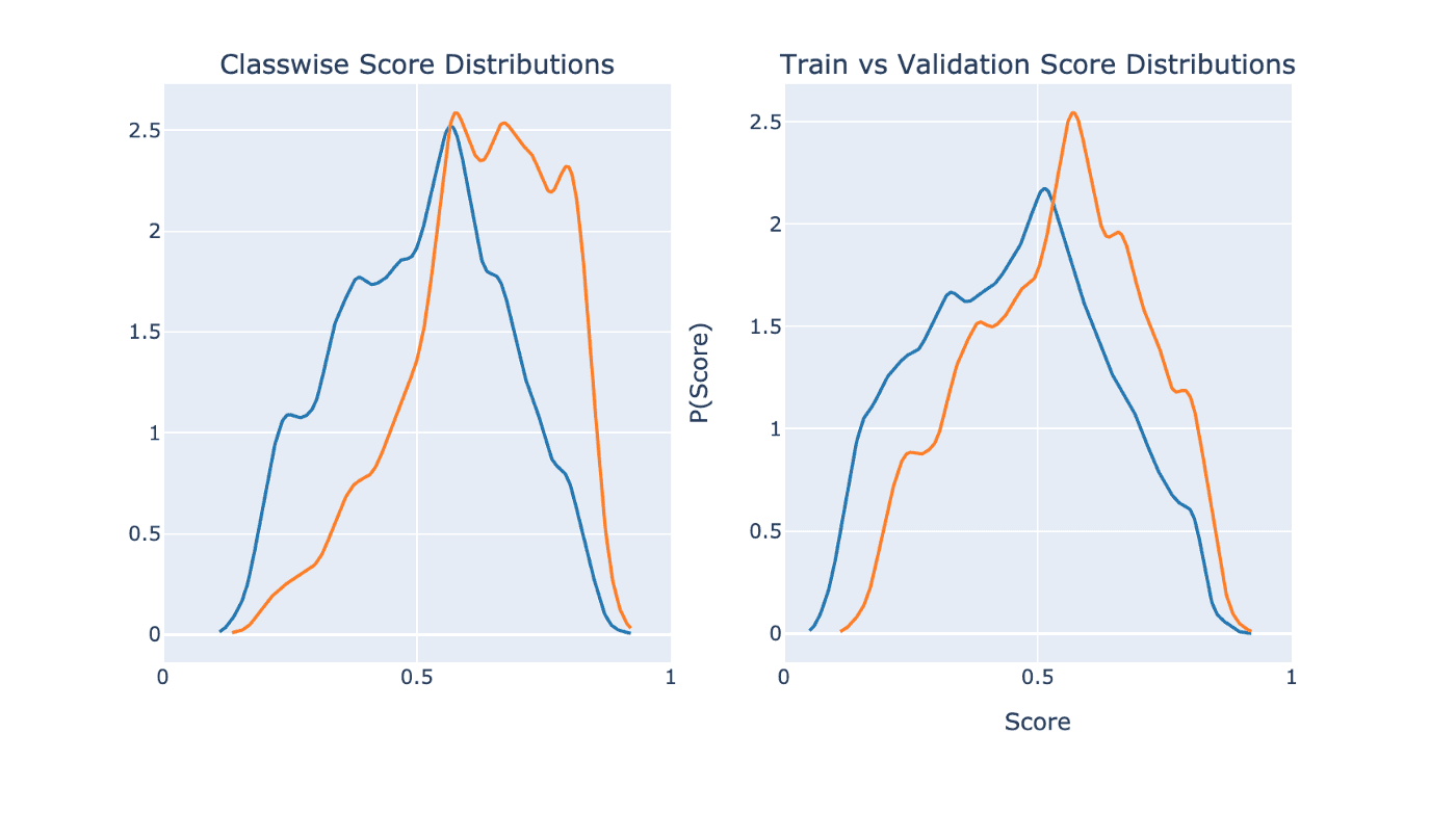
Confusion Matrix
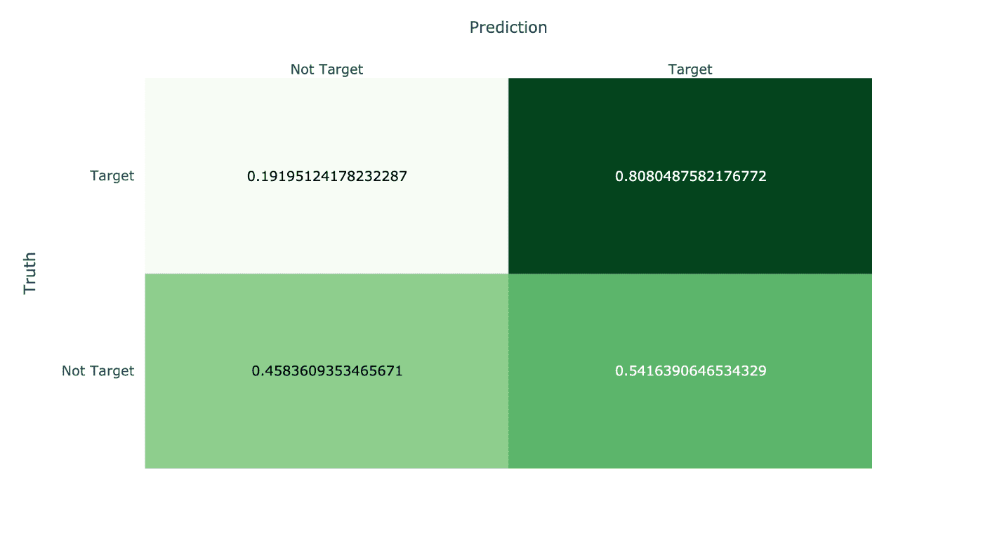
Digging further into model performance, let's visualize its misclassifications. The ideal is for the northeast-oriented diagonal to contain all of the samples. Samples in the top-left are false negatives and samples in the bottom-right are false positives.
Consistent with the positive shift of the validation set score distribution above, we see that there are a significant amount of false positives on the validation data. This is a direct effect of that positive distribution shift, whether due to model bias or covariate shift.
Tradeoff Curves: ROC and Precision-Recall
Lastly, we have our performance tradeoff curves. Instead of choosing one, as many do, I present both and their subtle differences.
On the left, we have an ROC curve for our model. This curve visualizes how quickly the model can achieve increasing levels of true detection (recall) on the y-axis as you allow it to have increasing levels of false alerts on the x-axis. For binary classification, a truly random model would be correct around 50% of the time (1/N for N classes). For this reason, a dotted line is also plotted to indicate the random model's performance for each value of FPR allowance.
If you have a model performing worse than random, you have a lot of work to do :).
On the right, we have a similar, but different, tradeoff curve. This one visualizes the tradeoff of precision vs recall, or specificity vs sensitivity. Whereas the recall vs FPR plot of the ROC curve makes a tradeoff of "I want more of this (Recall) with less of that (FPR)", the precision vs recall plot makes a tradeoff of "I want this (Precision) and this (Recall) to be high."
Regardless of the plot you use, production applications of classification models usually want a black-and-white decision. Thus, you must threshold your decision making at a particular score. Both of these plots empower you to make this decision for you or your business. The choice lies in how you want to present the tradeoff, and which your audience may be more equipped to understand.
fpr, tpr, thresholds = roc_curve(y_validation, y_pred)

fig = make_subplots(
    rows=1, cols=2,
    subplot_titles=(
        "ROC Curve",
        "Precision vs Recall Curve"
    )
)

# ROC curve
# add dotted line to show the performance of randomly guessing (50%)
fig.add_trace(go.Scatter(
    x=[0, 1],
    y=[0, 1],
    line=dict(
        color='royalblue',
        width=2,
        dash='dash'
    )
), row=1, col=1)
fig.update_layout(showlegend=False)

# plot ROC curve, filling the margin above (or below!) the random guess line
fig.add_trace(go.Scatter(
    x=fpr,
    y=tpr,
    fill='tonexty',
    mode='lines',
), row=1, col=1)
fig['layout']['xaxis']['title'] = dict(text='FPR')
fig['layout']['yaxis']['title'] = dict(text='TPR')

# precision-recall curve
precision, recall, thresholds = precision_recall_curve(y_validation, y_pred)

fig_prc = px.area(
    x=recall, y=precision,
    title=f'Precision-Recall Curve (AUC={auc(fpr, tpr):.4f})',
    labels=dict(x='Recall', y='Precision'),
    width=700, height=500
)
fig.add_trace(fig_prc.data[0], row=1, col=2)
fig['layout']['xaxis2']['title'] = dict(text='Recall')
fig['layout']['yaxis2']['title'] = dict(text='Precision')

fig.show()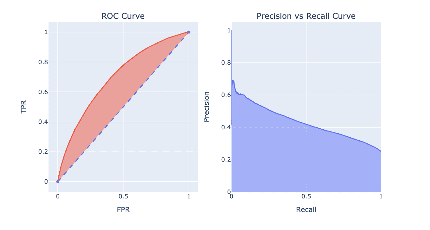
How Much Better Can You Do?
With everything set up for you right in this notebook, all you need is the desire and focus to make this model much, much better. I've added some suggestions below, all pertaining to non-deep-learning strategies. Deep neural networks can do plenty of feature engineering, but there remains much to be learned in the intricate details of manual feature engineering and model building. Don't let deep learning gurus sway you into thinking that DNNs can auto-magically solve all of your problems. They perform amazingly in some scenarios, but there is still plenty of work to be done in all areas of machine learning.
Use the Resolution Column
Use the feature for more informed stratification of train and validation sets. A simple usage of stratification would use the Category feature as the label for splitting data, which is much more coarse. By using additional information for splitting, you further unsure that your train and validation data distributions are as equal as possible.
Alternatively, you can transform the feature to a one-hot encoding and add an additional feature that indicates if the Resolution feature is missing. The one-hot features will provide more information to the model for learning, and the is_missing feature can simply be raised high during test time. You may think that the is_missing feature will act as a disable button for using the one-hot features. This would only occur when the data distributions presented at training for is_missing=1 and is_missing=0 are equivalent.
Use the Descript Column
Train with Descript as the training and validation label directly, and use a Descript -> Category mapping for test predictions. By training on the more granular classification as the target, you provide more rich feedback to the model. With the presumably-stronger model trained, you use the mapping built to transform test-time Descript predictions back into Category predictions for measurement/usage.
Literally Anything Else
This is the beauty of feature engineering with data. Take any far-fetched idea you have, and build a feature from it. When done correctly, the training and validation process will be the arbiter of whether your feature is helpful or garbage. That's just...life with data.
Resources
- [Launch my Deepnote notebook directly]
- [Kaggle competition] for the SF crime data set
- A fantastic [Kaggle notebook] on the data set by Yannis Pappas (some code re-used here)
- San Francisco government's [OpenData] initiative
- The
pandas_profilingGithub page. - Plotly's wonderful [Python support].
- More from yours truly at [Life With Data], [Twitter], and [Medium]
Keep Learning
👋 Good read?
Subscribe for more insights on AI, data, and software.
